


Natural Patch (NATPAT) is a wellness brand that creates science-backed sticker patches infused with essential oils - like sleep, focus, mood, and bug protection. Designed with kids in mind but for all ages, their products blend nature and aromatherapy into playful, wearable solutions that make well-being feel easy and fun.
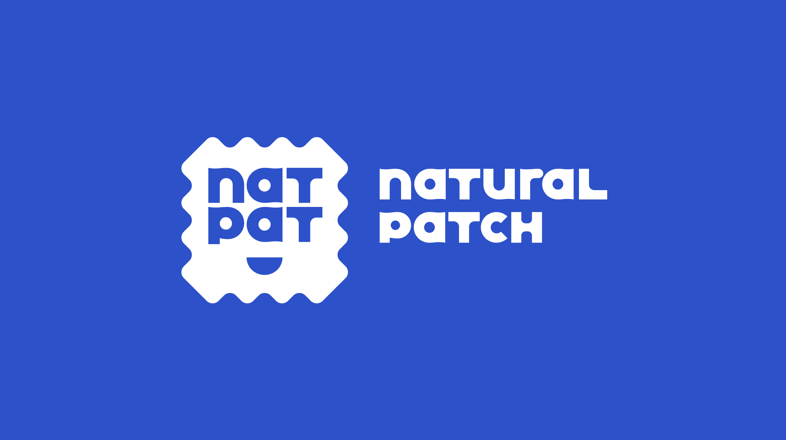
The new NATPAT logo introduces the patch shape as a bold, instantly recognizable emblem in the natural health market. Its distinctive silhouette ensures strong shelf presence and brand recall, anchoring the brand’s natural, playful, and approachable identity in a form that’s both iconic and unmistakable.
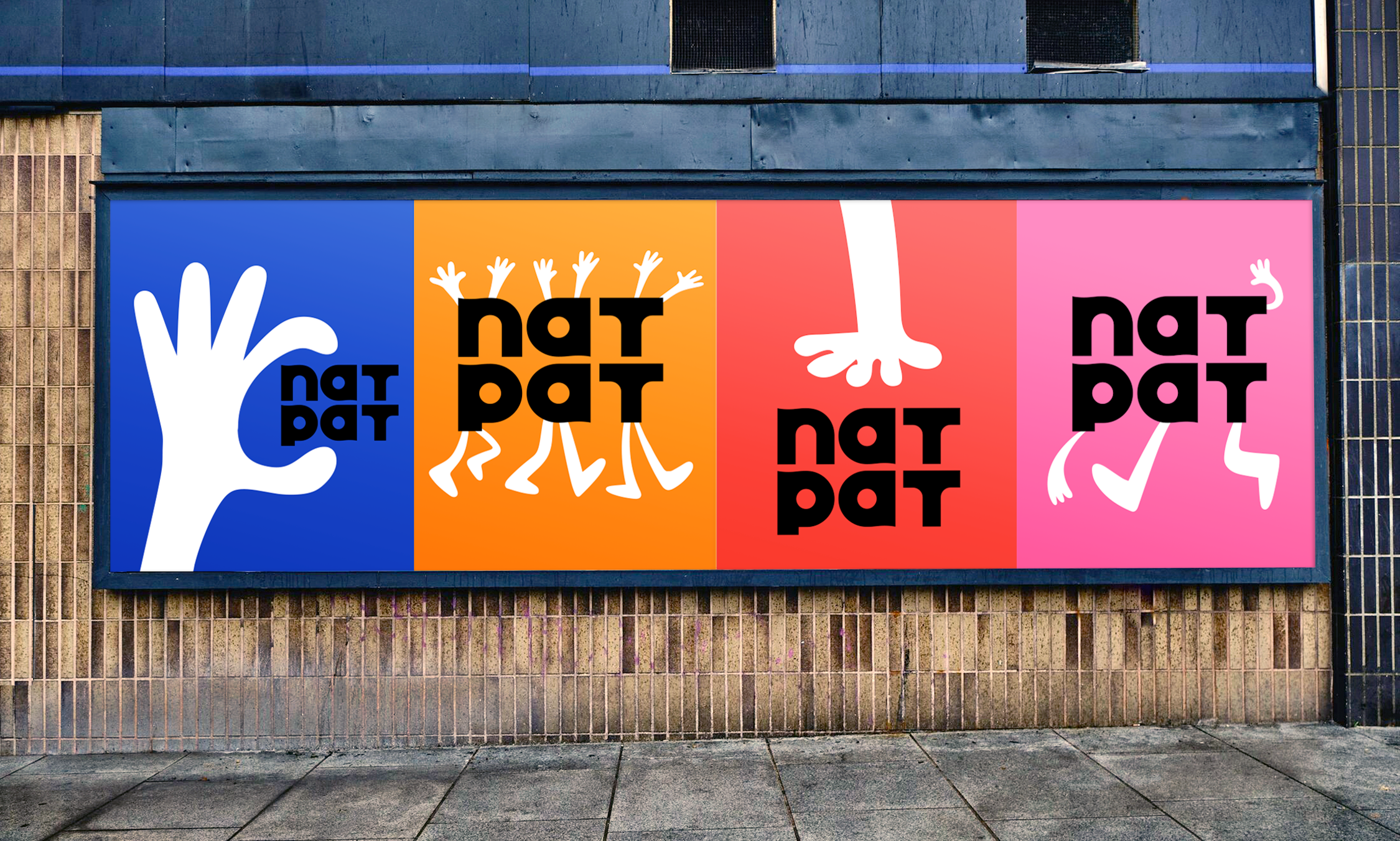
Interlocking, rounded shapes inspired by the NATPAT logo form a cohesive visual system. These modular elements adapt across packaging, product, and digital—reflecting the brand’s playful, caring, and flexible character.
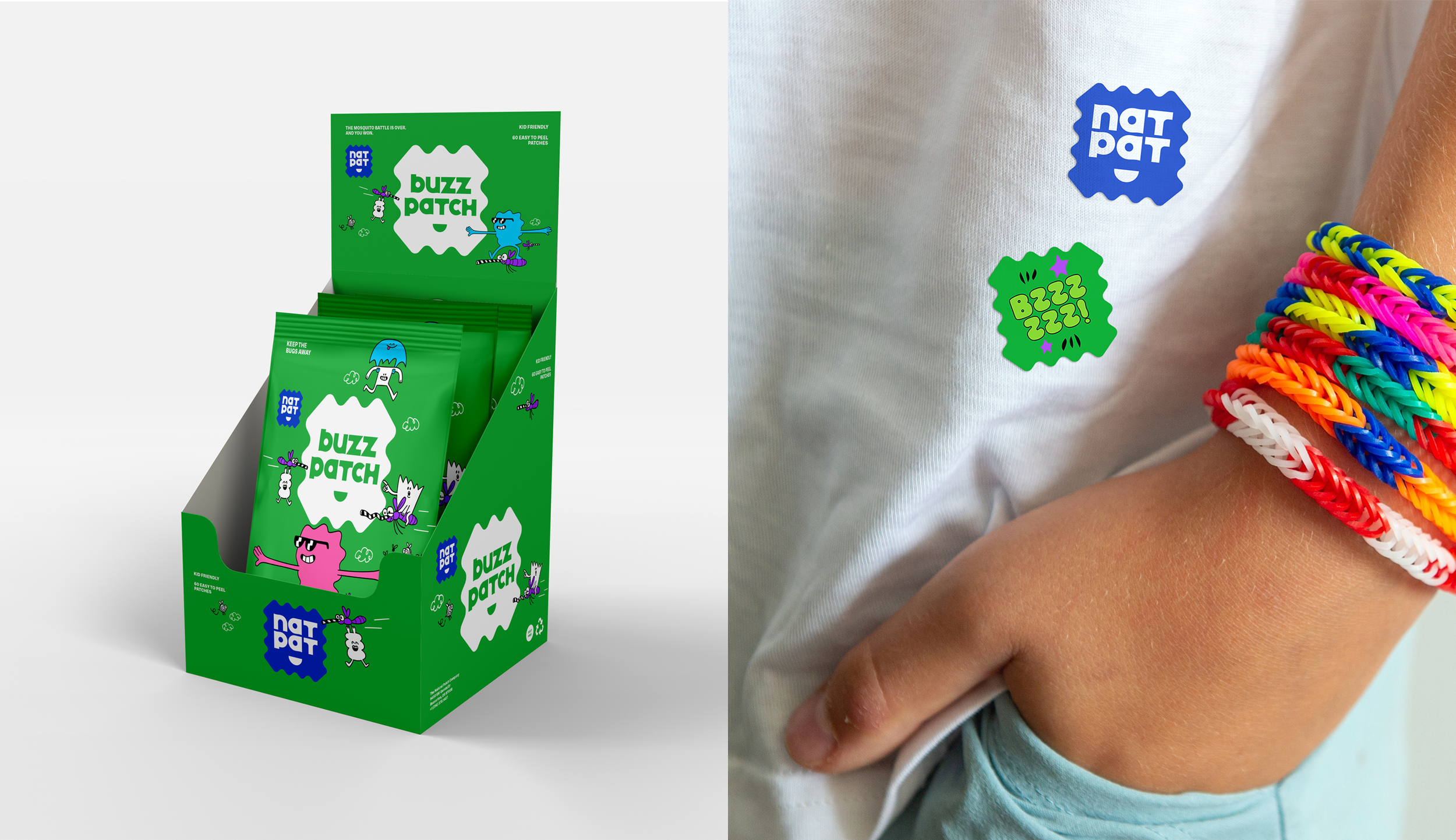
Custom packaging was designed in the shape of the NATPAT logo—playful, iconic, and made to stand out in any setting. It’s eco-friendly, reusable and perfectly sized to hold sheets of patches inside.
Custom animations were created to illustrate each product benefit—adding fun, clarity, and cohesion across the system, from packaging to patches, to elevate the brand experience at every touchpoint.
A custom font was stylized for the NATPAT logo and product names, reflecting the brand’s bold, friendly personality. The letterforms reflect shared design characteristics with the logo shape and smile icon.
A system of expressive sticker patches uses custom illustrations to bring each product’s benefits to life—inviting kids into NatPat’s imaginative world while building understanding and brand love.
(w/barrydeck.com, gregkletsel.com)