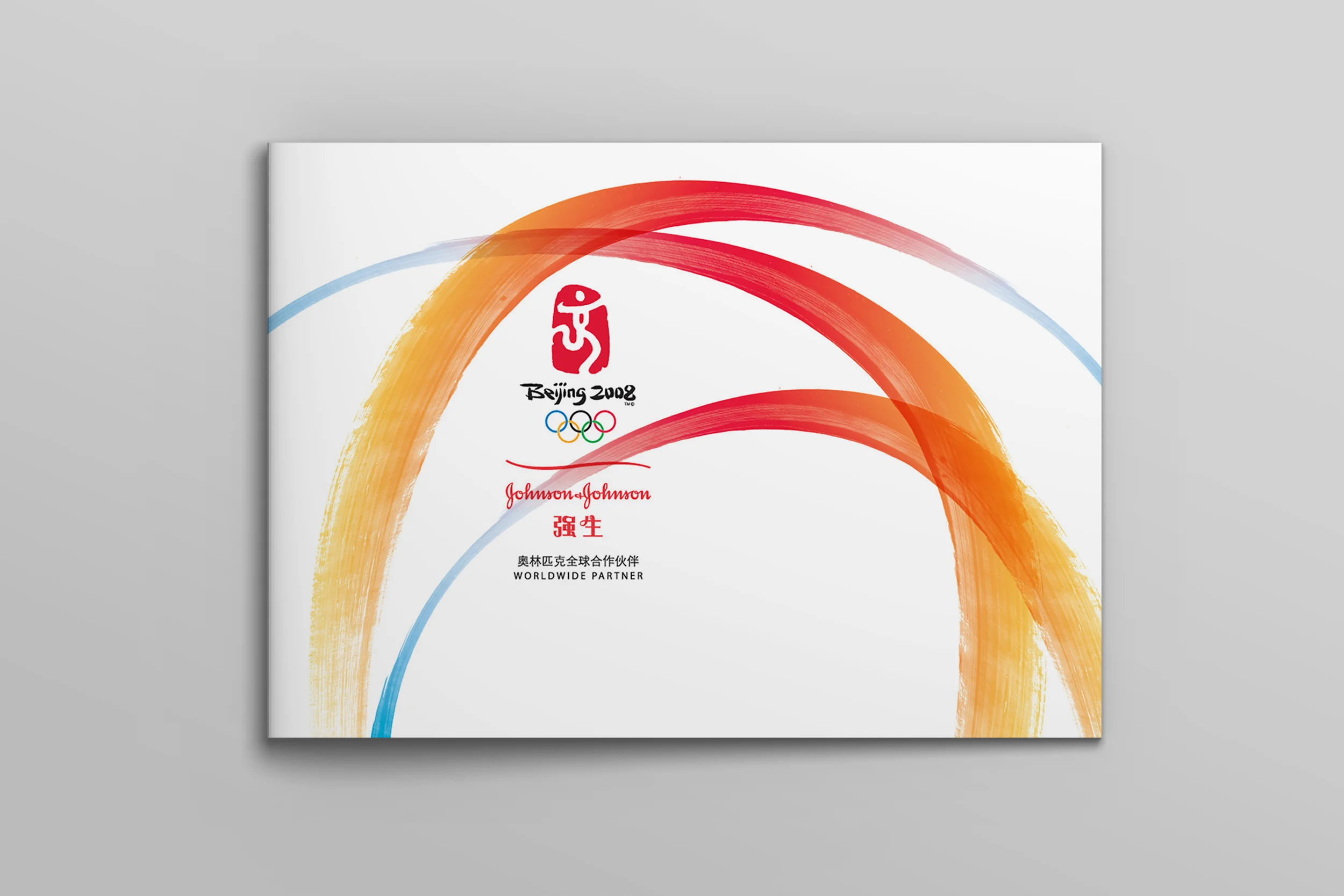


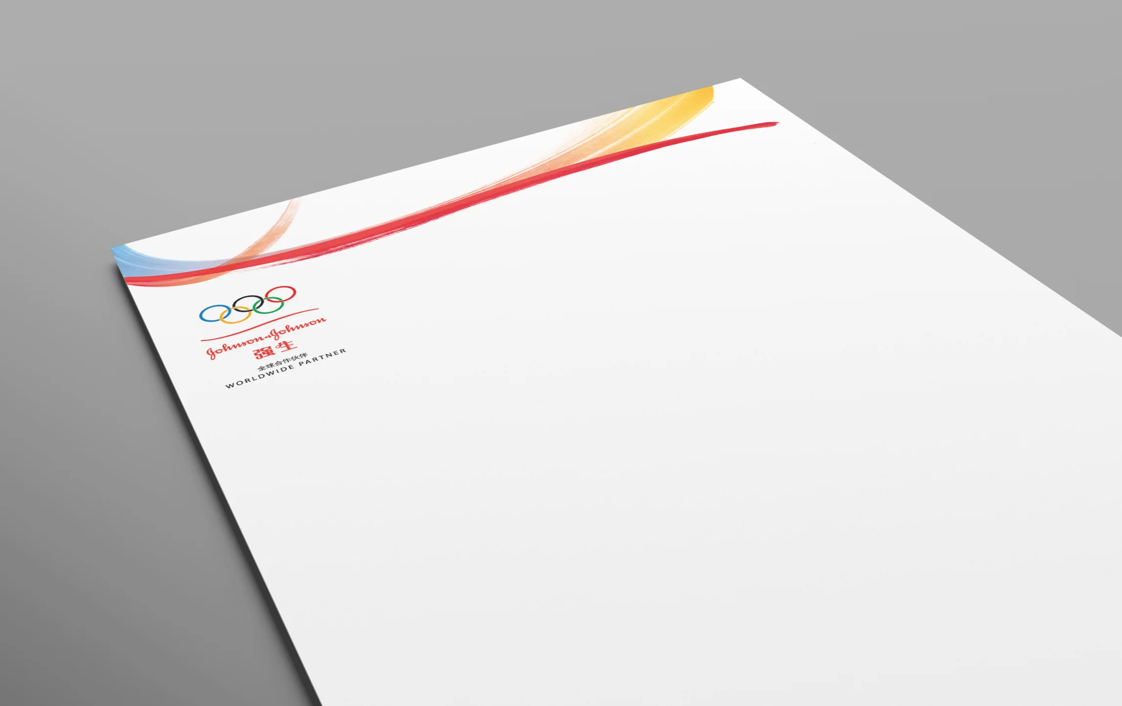
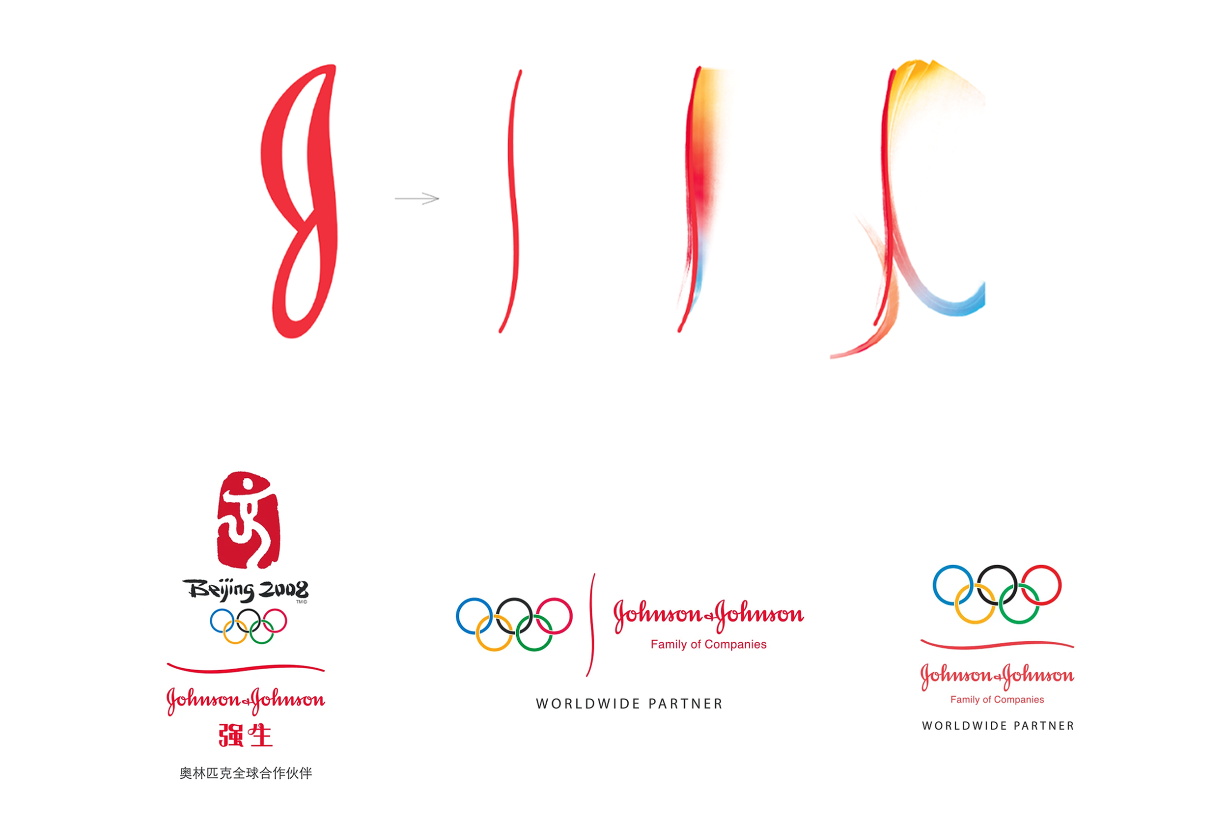

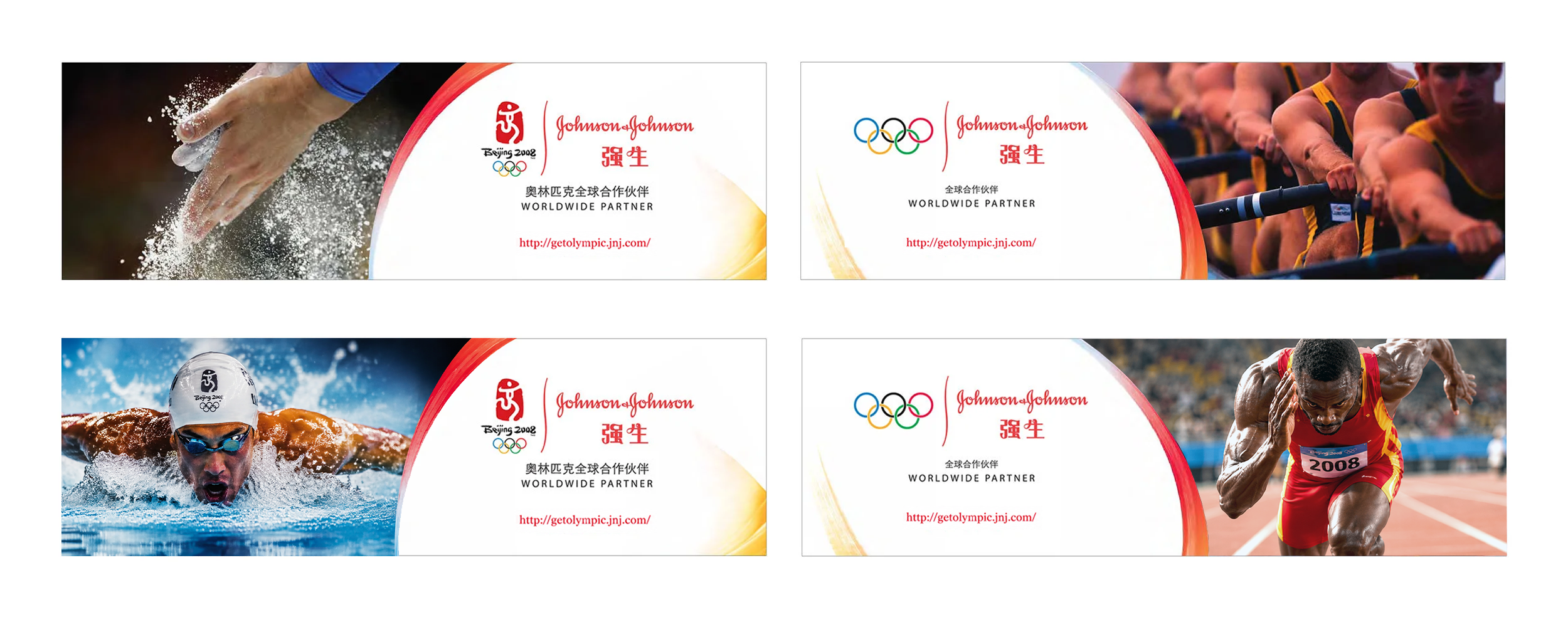
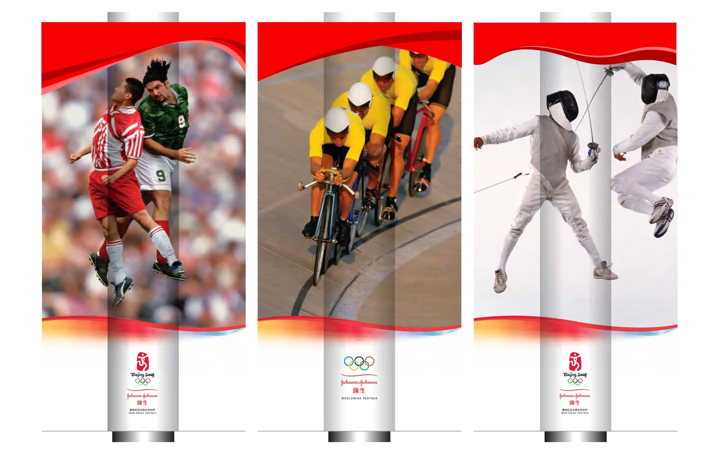

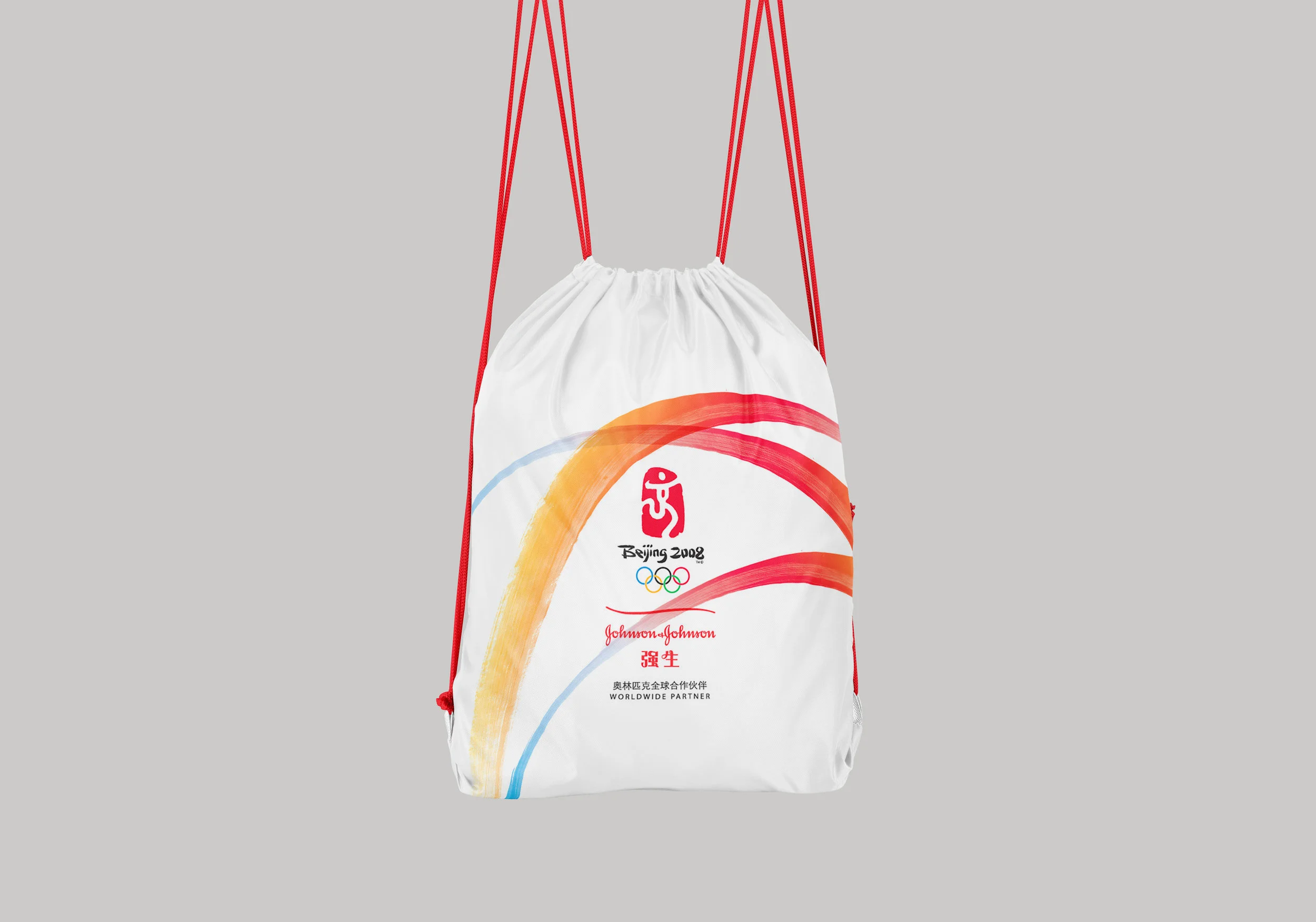
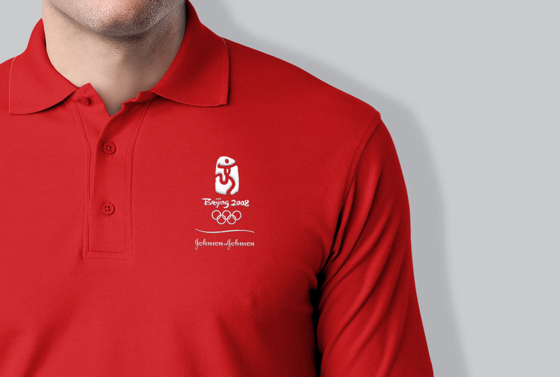
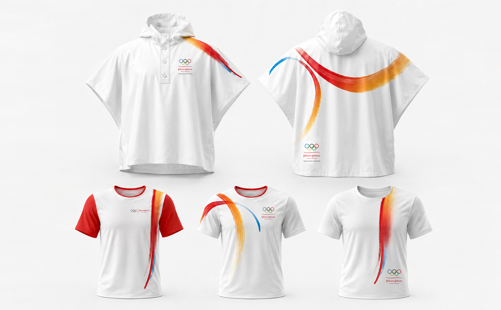
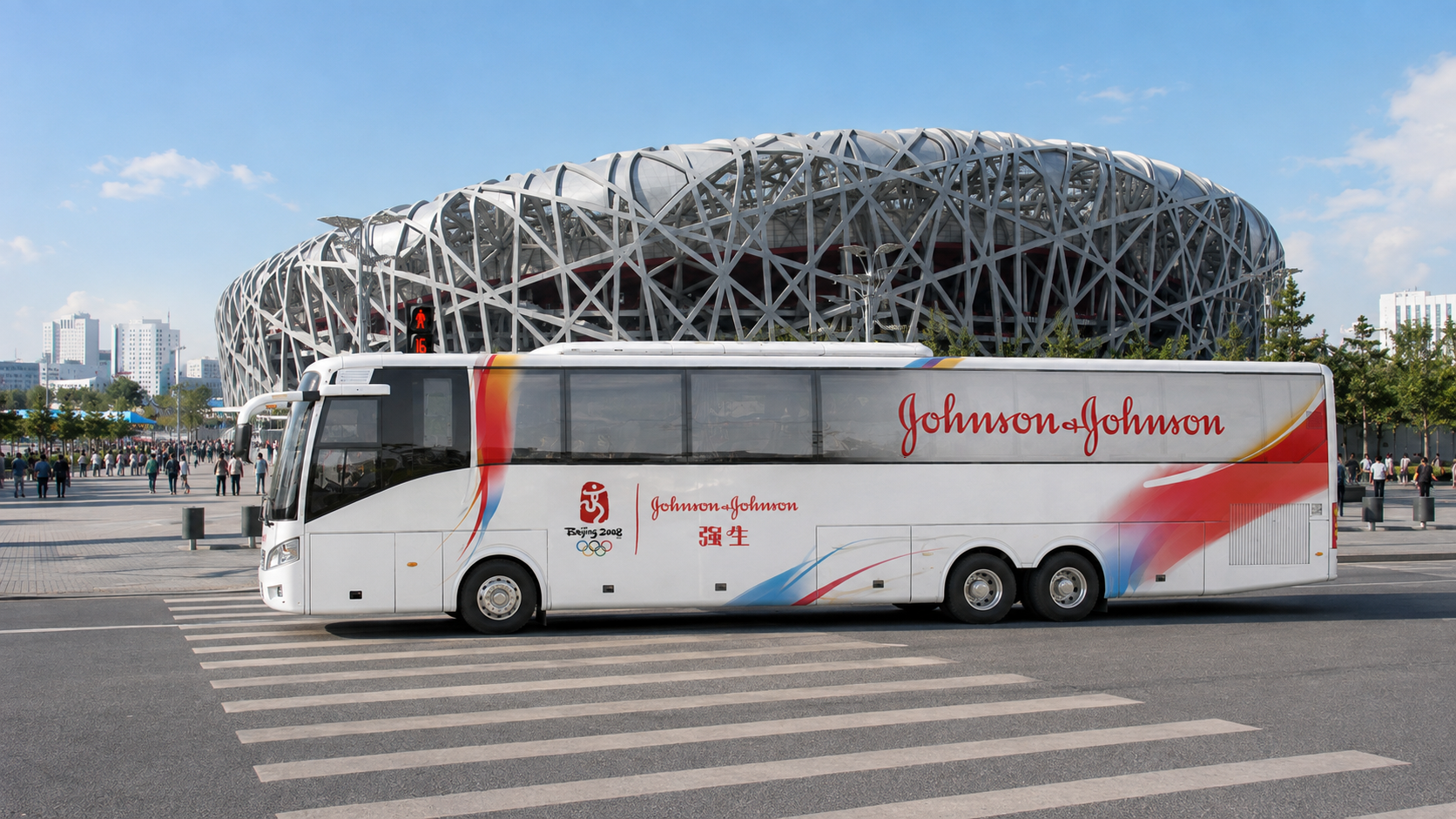



Developed a visual identity system for Johnson & Johnson’s Beijing 2008 Olympic partnership, extending the brand’s signature red into an expressive graphic language inspired by movement, human touch and the energy of the Games.
The system established a distinct Johnson & Johnson presence across Olympic activities and related communications, creating a unified visual language that could stand apart within the intense visual environment of the Games.
The graphic language connected Johnson & Johnson’s core brand attributes of trust, care and health with the integrity and energy of sport and the warmth of Chinese culture. Expressive, hand-rendered brushstrokes brought a more human quality to the system while creating movement, consistency and a recognizable Johnson & Johnson point of view across applications.